Make Your Wedding Business Website Irresistible in 2026
Someone has just been given your name. A friend's recommendation, a venue coordinator's mention, a fellow supplier singing your praises at the end of a long wedding day. They are interested. They go home, open their laptop, and search for you - and in that moment, before a single word has been exchanged between you, your website is doing all of the talking.
The question is: what is it saying?
When a client finds you without context
your website is doing all five of these jobs at once
The moment that changes everything
I want to tell you about an experience I have had more than once, and probably so have you.
I met someone at a networking event. Someone who was warm and clearly talented, the kind of person who lights up when they talk about their work. Their Instagram looked considered. Their social presence felt aligned. I was genuinely excited about the idea of working with them.
Then I looked at their website.
The design did not match the person I had just met. The copy felt generic, as though it could have belonged to anyone in their industry. There was no pricing, which immediately created friction. Nothing flowed. And within a few minutes, the excitement I had felt in person had slowly disappeared.
The website completely undid all of the positive steps that had come beforehand.
That is the invisible moment. It happens every day, across the wedding industry, to professionals whose work is genuinely exceptional. And most of the time, they have no idea it is happening.
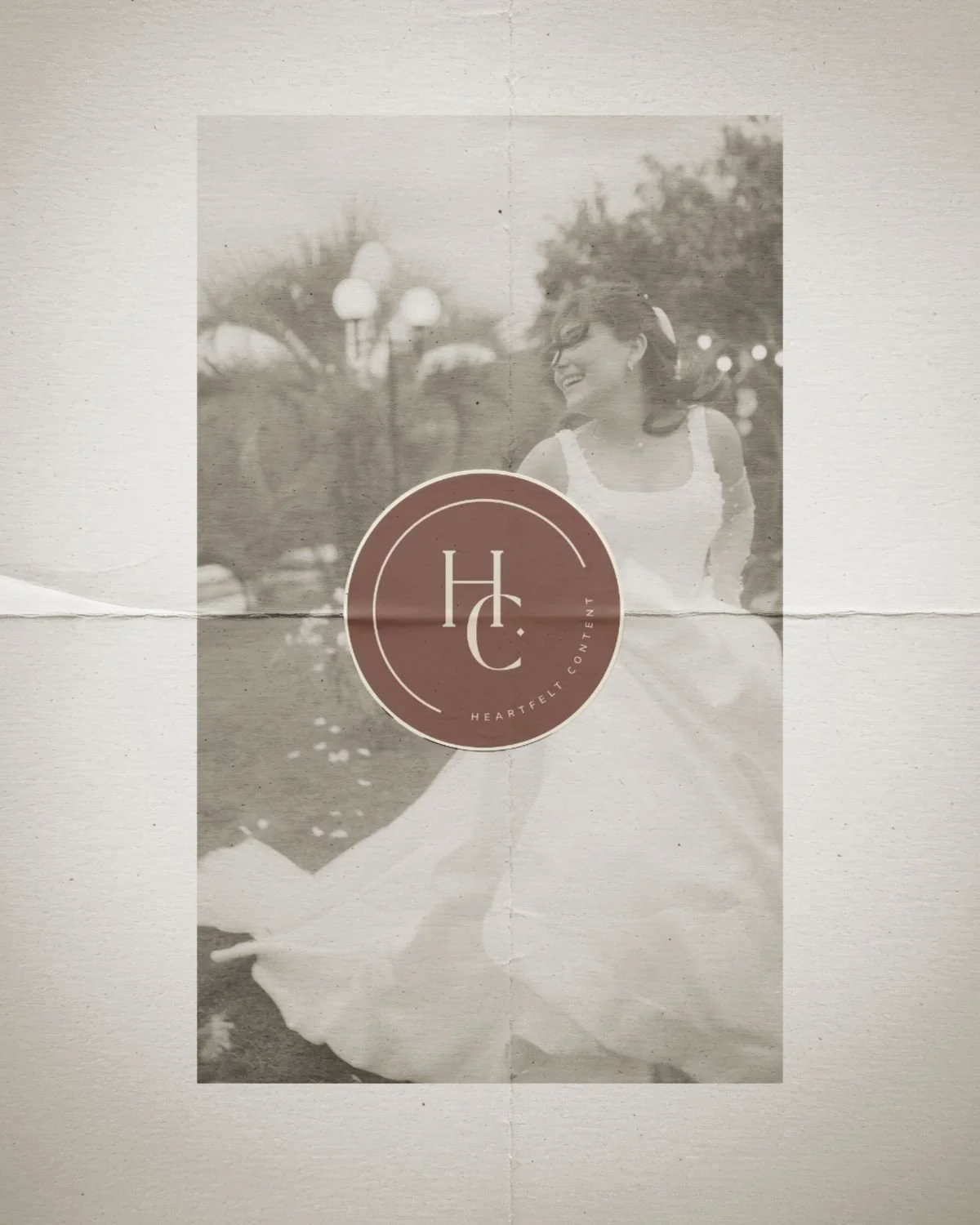
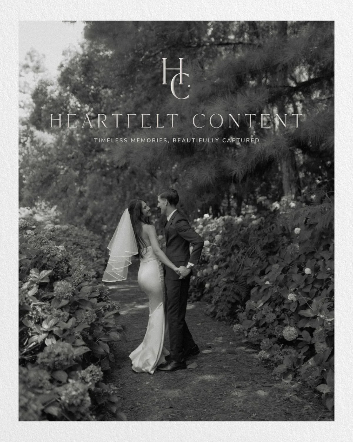
Heartfelt Content
What your website is actually being asked to do
When someone finds you cold. No referral warming them up, no Instagram relationship built over months, just a late-night search. Your website has to do something remarkable.
It has to presell you entirely on its own.
No charm. No conversation. No chance to answer a question or explain your process. Just the website, doing the work of communicating who you are, what you do, who you do it for, and why that matters. All before anyone has typed a single word into your contact form.
Think about ten wedding photographers with identical services and identical pricing. In that scenario, the only thing that makes one feel like the right fit is the brand. It is the specificity:
The photographer who celebrates working with LGBT+ couples and makes that central to their brand
The florist whose commitment to seasonal, UK-sourced flowers is woven into every page
The planner whose meticulous process is felt before it is ever explained
These are not small details. They are the reason someone reaches out to one business and not another.
If your website is not communicating your differentiator clearly, it is not just underperforming. It is costing you aligned enquiries every single week.
This is also why the argument that you are already fully booked through referrals deserves some scrutiny. Referrals are powerful. But they rely on someone already knowing your work.
Every time a potential client arrives at your website without that context, your online presence is being asked to do a job it may not be equipped for.
I wrote about the connection between under-presenting and undercharging in more detail in Why Wedding Professionals Undercharge and How to Fix It - and the two are more directly linked than most people realise.
The stamp of approval
When a potential client lands on your website, they will assume one of two things: that you built it yourself, or that you commissioned someone to build it for you. Either way, they will assume you approved it. That you looked at it and thought: yes, this represents me.
Which means a website that does not match the calibre of your work does not just look like a dated website. It looks like your standard. It looks like the level of attention and care you bring to everything.
That is not a fair assessment of who you are. But it is a human one. We are all making those judgements constantly, often unconsciously, in the first few seconds of landing on a page.
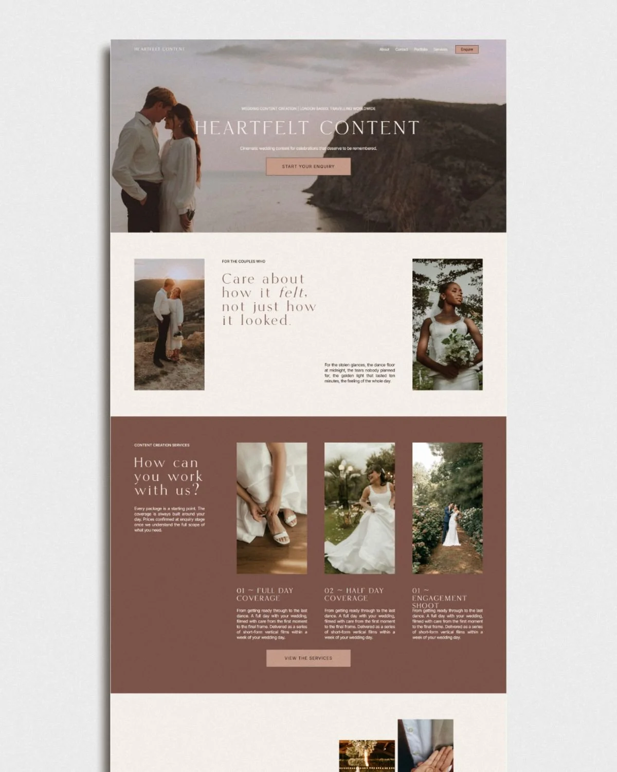
The wedding professionals whose websites do this job properly share something in common. Every element feels considered. The navigation is clean and clearly labelled. The hero section tells you immediately what they do, who they do it for, and where they are based. Because none of those things should require a search. The user journey moves a visitor naturally from curiosity to confidence, from the homepage through to services, portfolio, and contact.
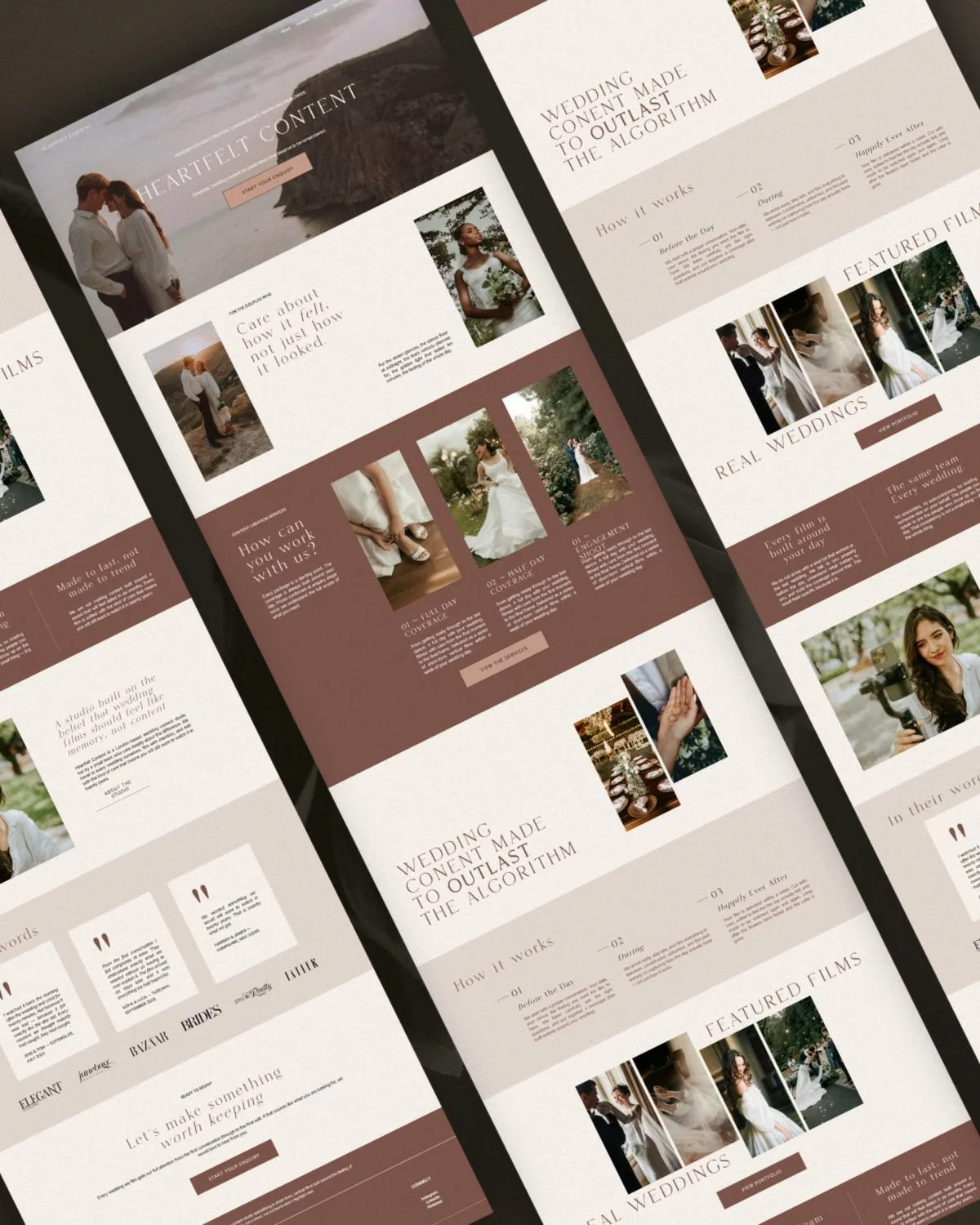
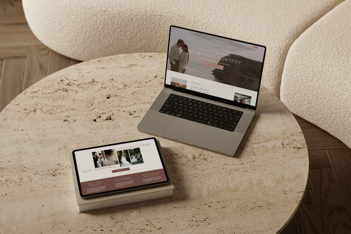
Case study: Heartfelt Content
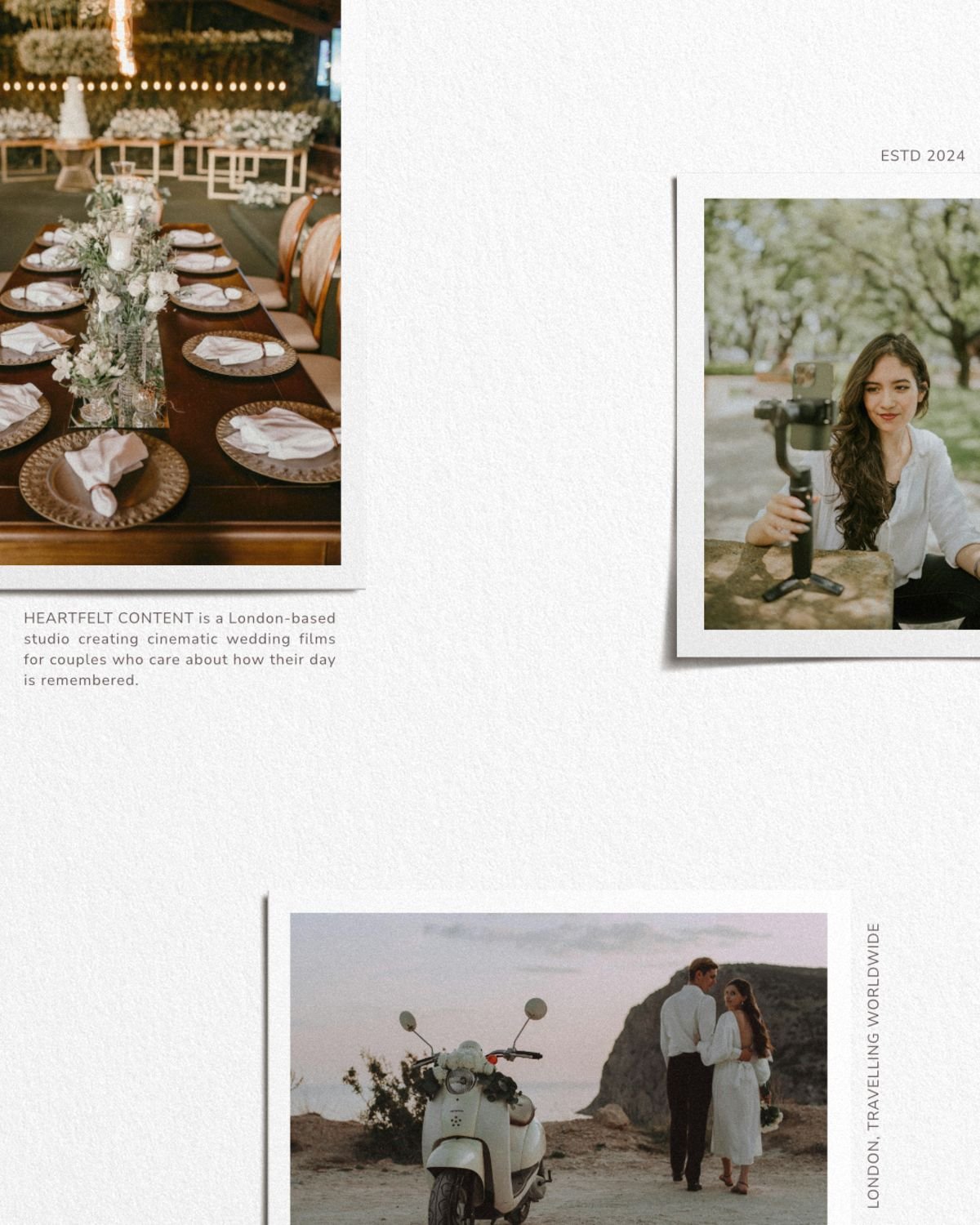
Heartfelt Content is a strong example of a website that communicates credibility before a word is read. Press logos sit where they should. The design is coherent with the work being shown. A potential client landing on that page cold does not need to be convinced of the quality. The presentation makes the case before they have finished scrolling.
That is what a well-built website achieves. Not just beauty, but trust, earned before any conversation has taken place.
What the first few seconds need to do
The homepage hero section - everything visible before a visitor scrolls - is carrying more weight than most wedding professionals give it credit for.
It needs to answer three questions immediately:
What do you do?
Who do you do it for?
Where are you based (if location matters to your business)?
If a potential client has to start digging to find any of those answers, they will leave.
Navigation
Is the other area where I see talented wedding professionals losing enquiries. Too many options create decision fatigue. And labelling those options with names that make sense internally. The name of your signature package, a clever phrase that means something to you. These may be creating confusion for someone arriving with no context at all.
Keep it simple:
Services
Portfolio
About
Contact
Those labels are clear. They also happen to be what search engines understand. Clarity serves your potential clients and your SEO at the same time.
Every section of your website should be there for a reason. Every design decision should earn its place.
A website that feels seamless does not happen by accident.
It is the result of intention at every level, from the hierarchy of information to the weight of a font.
Heartfelt Content
When the website was holding everything back
I worked with a wedding professional who came to me wanting to attract younger couples with higher budgets. They were established, sought-after in their area, and producing work they were genuinely proud of.
But the enquiries they were receiving did not match where they wanted to take the business. The couples finding them were older, more price-focused, and the conversations were often going in a direction that felt misaligned.
When I looked at their existing brand and website, two things were immediately clear:
The logo was over a decade old: It had the visual language of an earlier era, and it was signalling that to every potential client who landed on the page.
The imagery had been edited in a style that reinforced the same impression: Together, those two things were telling a story. Just not the story this business owner wanted to tell.
The conversation we had was one of the more direct ones I have had with a client.
These are likely the things holding you back from charging more, from attracting the couples you want to work with, and from approaching the venues you aspire to be recommended by.
Once that was named clearly, the path ahead became straightforward. A brand that reflected where they were now, not where they had started, opened up the conversation about the clients and the price point they had been working towards for years.
The work had always been there. The presentation just needed to catch up.
Your website is making a first impression right now
Not when you are ready. Not when you get around to updating it. Right now, tonight, someone is looking at your website and forming an opinion about your business.
The question is whether that impression matches the true calibre of what you do.
If there is a gap between the two, I would love to help you close it.
The Aretta Effect brings your brand and website together over eight weeks, so that everything a potential client sees - before they have ever spoken to you - is doing the preselling your work deserves.
If you would like to talk through what that could look like for your business, please do get in touch. No pressure, no pitch. Just a conversation.