brand & website design | Tide & ThymeWhere coastal living meets considered brand design
A considered florist website design for Tide & Thyme Flower Farm, designed to establish a consistent brand presence and increase aligned enquiries.
clientTide & Thyme Flower Farm
industryWedding florals
locationSouth-west, UK
requirementsBrand - Illustration - Website
chapter 01 - The briefA brand catching up to a business that had already moved on.
Before this project began, Tide & Thyme felt like a business that had outgrown its own presentation. The brand was holding it back rather than doing it justice. It didn't yet reflect the care, the craft, or the calibre of what was actually on offer.
The goal was to step into something more considered. A presence that felt genuinely aligned with where the business was now, and that spoke clearly to the couples most likely to fall in love with what it does.
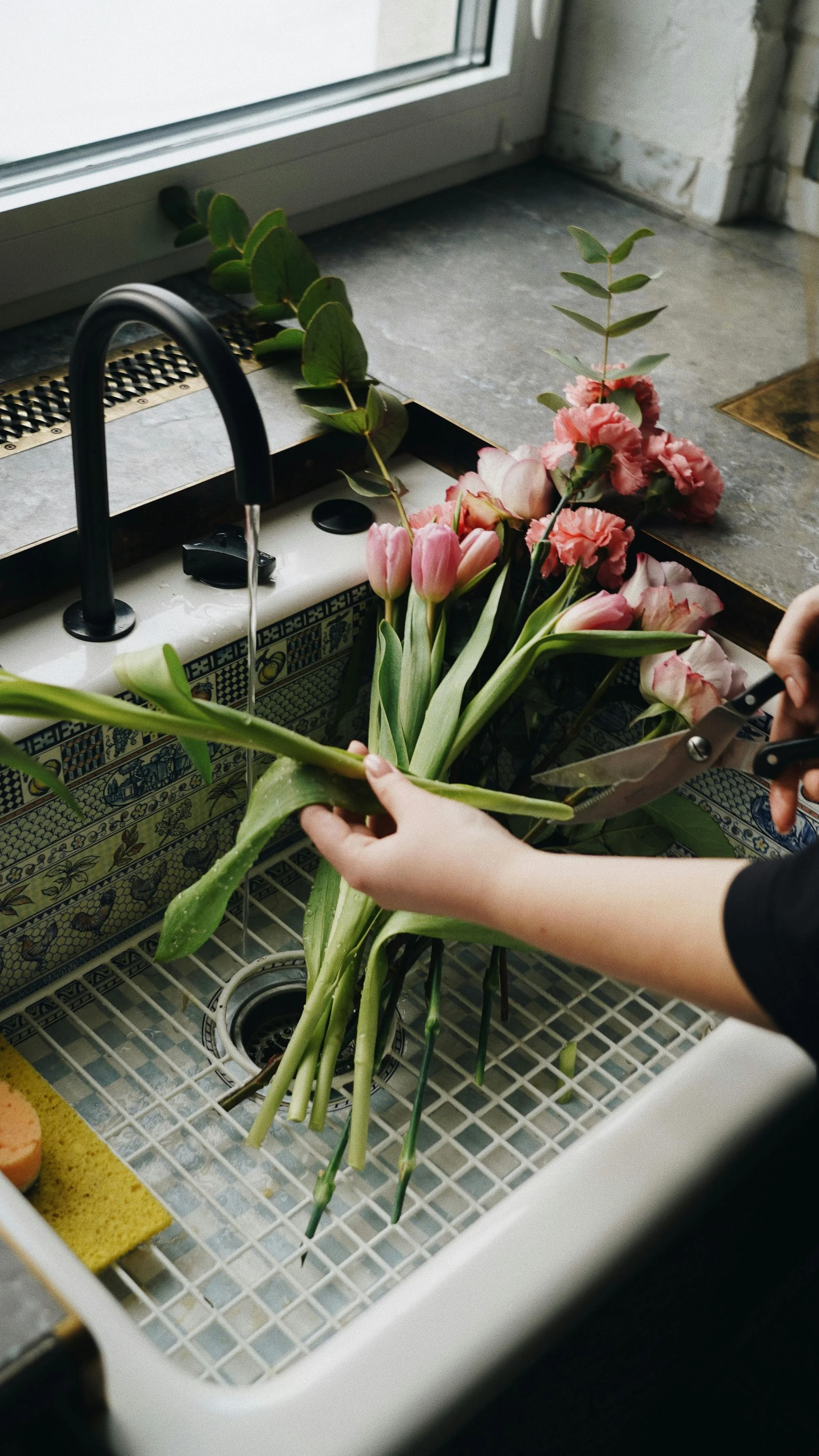
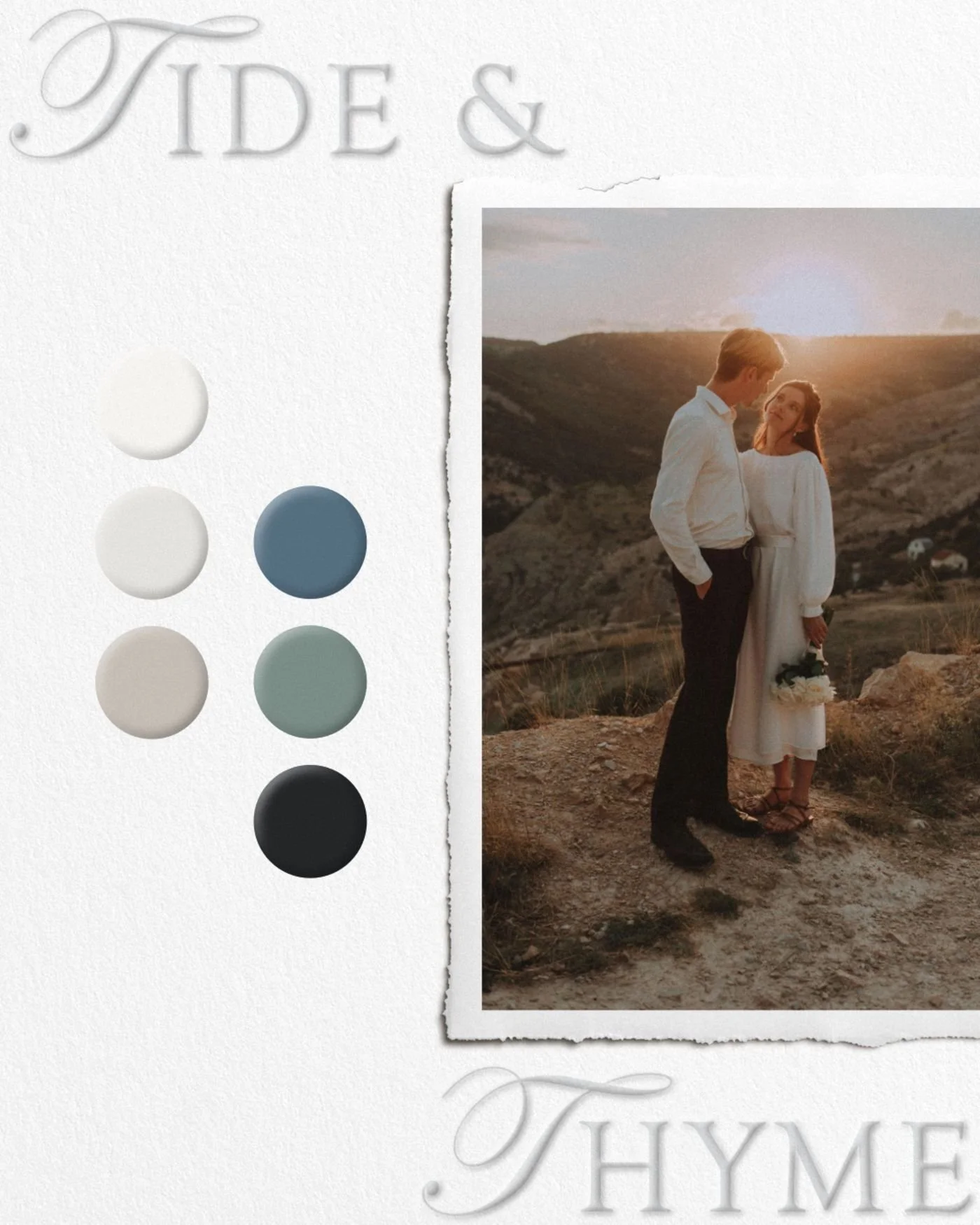
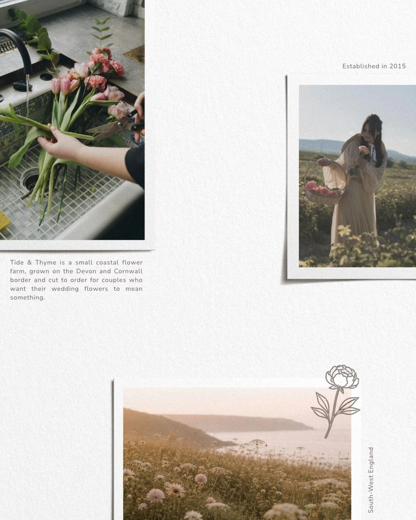
Working with a brief built around the Devon and Cornwall coastline, the farm's connection to the seasons, and a deeply personal approach to growing and arranging, the direction became clear early on. Rooted and unhurried, but elevated. The kind of brand that makes you want to slow down and look more closely.
Tide & Thyme is a self-directed passion project.
Coastal · Seasonal · Handcrafted · Elevated · Considered · Unhurried chapter 02 - The visionCouples planning luxury weddings aren’t shopping for flowers. They’re choosing a feeling.
And a person to trust with that feeling. Tide & Thyme couldn’t present as a simple shop - it had to read as an atelier with a postcode, a season and a hand. Three decisions came out of that.
oneLand before product
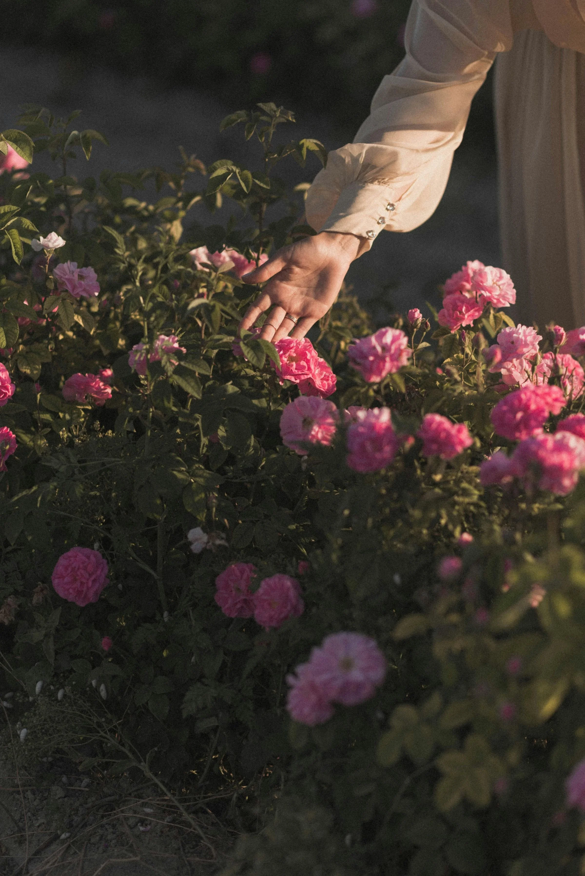
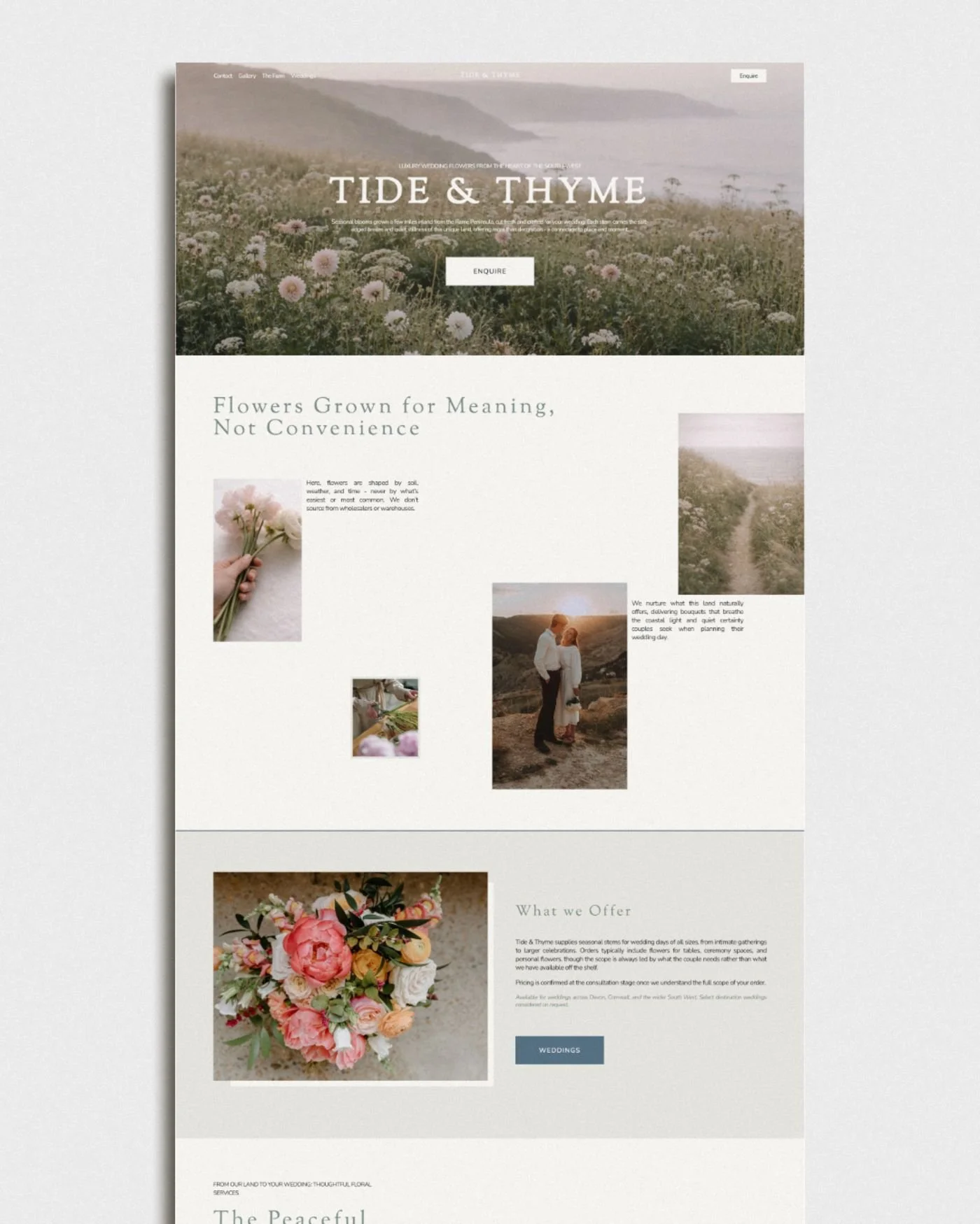
The website opens on Devon coastline, not a bouquet. Place is the brand; the flowers are a consequence of it. Atmosphere first, offer second.
twoVoice over volume.
No shop-now urgency. Long lines, slow cadence, considered language. Nothing happens fast on a flower farm; the website shouldn’t either.
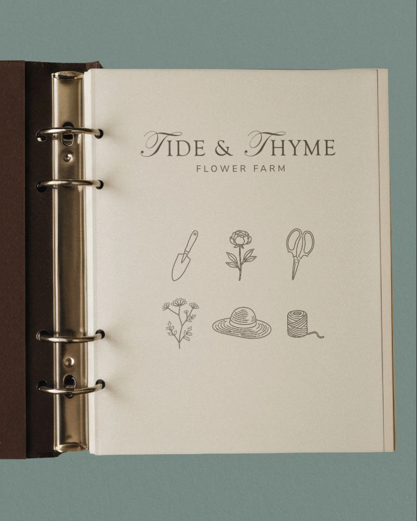
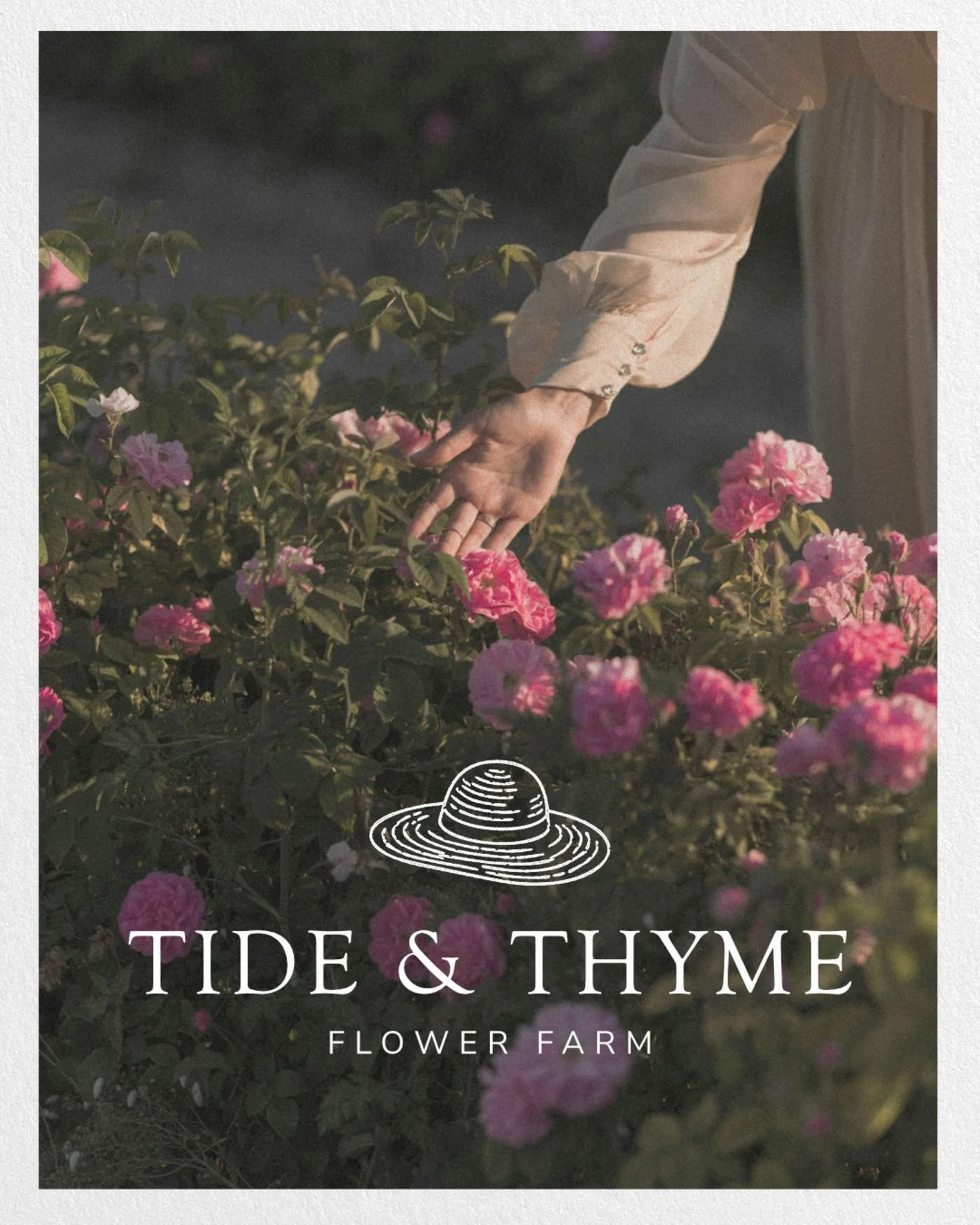
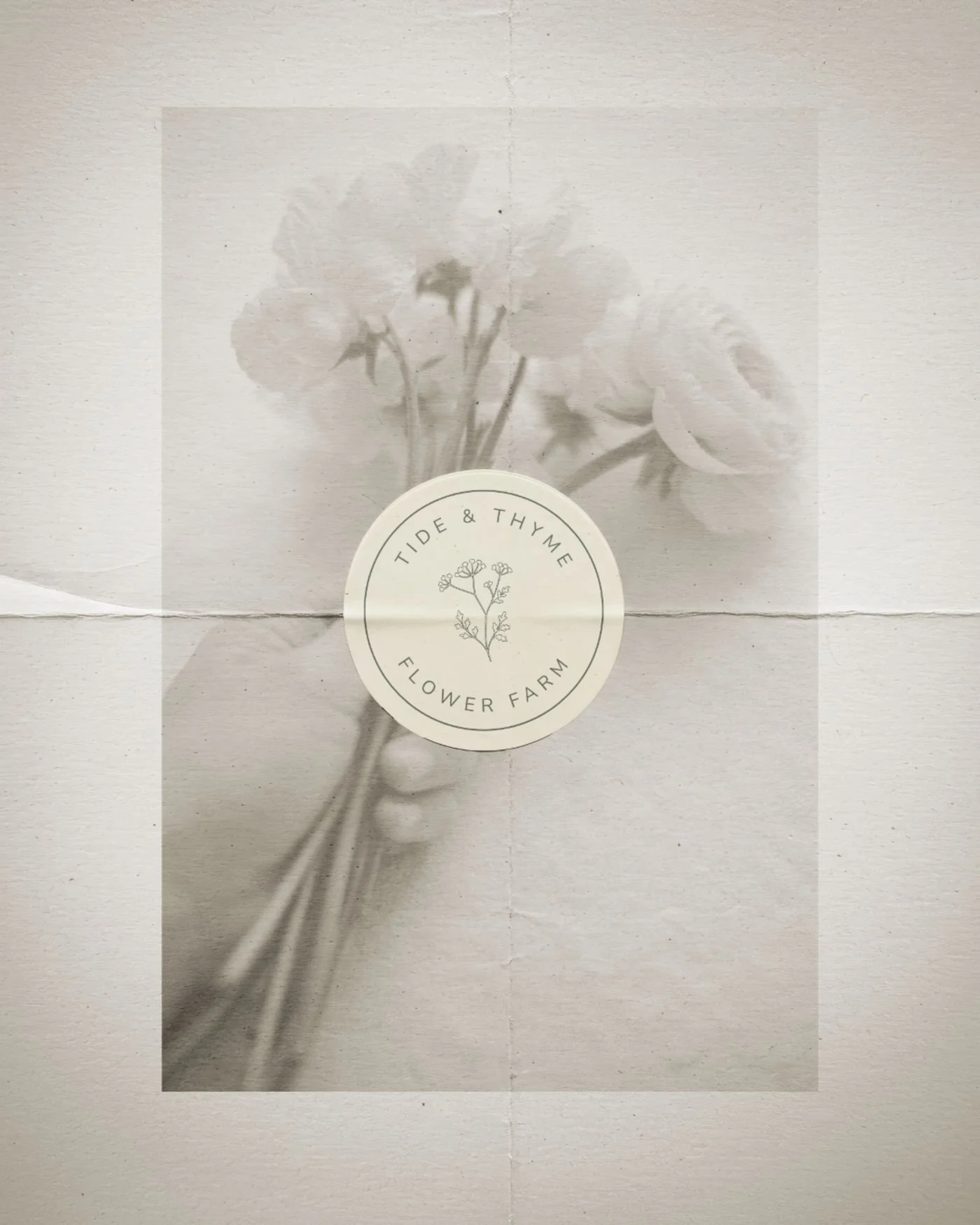
threeA hand visible everywhere.
Six custom illustrations - trowel, scissors, sun-hat, twine - drawn from the actual tools of the farm. Not decoration. Provenance.

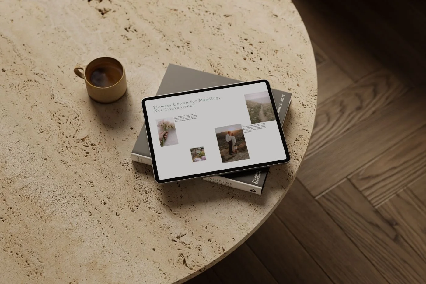
chapter 03 - The buildAn identity and a website built as one piece. Editorial and place-led.
From there, the brief translated into a visual and structural approach that felt both considered and functional - ensuring the design not only looked beautiful but supported the way the business works behind the scenes.
The brand direction was refined to feel editorial and elevated, drawing from the farm's coastal setting and the unhurried, handcrafted nature of the work.
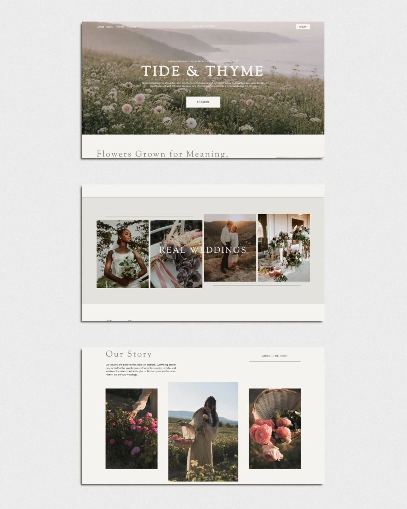
The website structure was simplified to improve clarity and flow, with user experience and conversion woven in from the start, allowing visitors to move through the site with ease and arrive at the enquiry form already informed.
Every element was designed to feel cohesive, thoughtful, and aligned with the level Tide & Thyme is stepping into.
chapter 04 - The aretta effectA brand that matches the level the business is already working at.
The website now does the work the founder was having to do on every call.
Aligned enquiries
Couples arrive already understanding the value, the process, and the investment involved. The conversation starts at the right level.
A pricing floor that holds
The brand makes the work feel as considered as it is. Pricing stops being the friction point.
A founder who shares the link
No more hesitating before sending the link. The brand matches the room and opens the right doors.
Visibility that isn’t borrowed
Less reliance on word of mouth, referrals, and other people's platforms. A presence that works for the business, not the other way around.
Ready to feel as considered as the work you do?
Whether you're starting from scratch or stepping into a brand that finally reflects where you are, I'd love to hear about your work.